Read the materials already present
Before choosing a botanical palette, list the surfaces that are staying: flooring, sofa fabric, curtains, cabinet fronts and any substantial timber furniture. These occupy more visual space than a new planter. A warm oak floor and a cool, pale wall can already provide enough contrast. The task is to help the foliage join that conversation, not to replace everything with a tropical theme.
Choose one existing finish to repeat near the plant. A timber frame can echo a chair leg; a matte dark pot can connect with a lamp base. This repetition gives the arrangement a reason to belong. Avoid buying several loosely related “natural” objects at once, since cane, jute, cork and rough ceramic can become visually busy when every surface asks for attention.
Build a palette with clear roles
Think in roles rather than strict color formulas. The background is the quiet field, the furniture supplies a middle layer, the plant contributes living variation, and a smaller accent sharpens the composition. Warm paper, ink, timber and a restrained red accent form one possible combination. The actual green comes from the plant rather than from trying to match every cushion to a leaf.
Test paint and textile samples in the room at different times. A sample that seems neutral in a shop can look strongly colored beside your floor. Renters can work with removable textiles, existing furniture and freestanding art rather than repainting. Always check tenancy conditions and the suitability of any removable adhesive before using it on a wall.
Use botanical art as a bridge
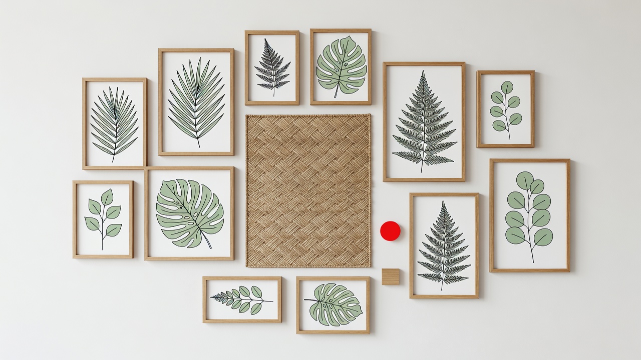
Wall art can carry the botanical idea into a place where living plants would struggle. A dim hallway, for example, may be a better home for a leaf study than for a pot that never receives sufficient light. Choose art for its shape and relationship to the room, not because it depicts the exact species you own.
The scientific illustrations of Maria Sibylla Merian and the plant studies associated with Pierre-Joseph Redouté offer different visual approaches to botanical subjects. The collections of the Royal Botanic Gardens, Kew and the Biodiversity Heritage Library can also inform your research. Check the rights and reproduction terms for each specific image; an old subject or historical artist does not automatically make a modern scan unrestricted.
Group frames as one composition with a shared visual center. Leave some wall uncovered around the leaves of the real plant so the two do not merge into a dense pattern. Secure frames appropriately and avoid placing unprotected paper where watering splashes or strong sunlight could damage it.
Balance rough and smooth
Texture works best when there is a contrast to notice. A glossy leaf beside a matte ceramic container can be enough. Add a woven throw only if the room needs that softness, not because a botanical room supposedly requires baskets everywhere. Linen, cotton, rattan and cork have different practical properties; none is automatically suitable for prolonged contact with damp containers.
A decorative basket needs an appropriate waterproof inner arrangement. Porous terracotta may transfer moisture and mineral marks to nearby surfaces, so protect furniture and floors. Keep loose textiles away from standing water and inspect concealed trays. Natural materials are still materials with maintenance requirements, and “natural” is not a guarantee of durability, safety or a lower environmental impact.
Finish by taking something away
View the arrangement from the doorway and identify its strongest element. If it is the plant, the surrounding objects should support its outline. If the main attraction is a dramatic botanical print, a simpler plant silhouette may work better nearby. Competing focal points are not inherently wrong, but a compact room often benefits from one clear lead.
Remove a small object, fold away a patterned throw or clear the top of a cabinet before deciding that the space needs another purchase. Move an existing frame or pot first. The point is not minimalism for its own sake: it is enough contrast and empty space to appreciate the texture you keep. A room feels considered when its materials repeat with purpose and its surfaces remain useful.